Just here for the files? Click here to download a package with all our new assets!
This page shows a selection of elements from the new giosg visual style. The aim is to provide a set of elements and instructions that make it possible for all designers and employees to adopt a single, consistent giosg look.
For now, this is a placeholder site primarily used to deliver the new logo files along with some documentation for the new giosg visual style. It will later be replaced by a more comprehensive collection of all the design assets and guidelines used both in the giosg services and for the giosg brand.
If you have a question about anything related to the guidelines that is not answered by this page, ask the design team. We will update the documentation as needed.
The giosg logo is available in two main styles: the basic everyday variant and the “party mode” variant. This section contains instructions on when and how to use our two main logo styles, as well some additional variants.
By offering our logo in two main variants, our new logo retains the intense colorfulness of the old logo while also offering a more toned down, scalable alternative for "day-to-day" use. By choosing whichever logo fits the task better, we can always retain a sufficient balance between colorfulness, recognizability and readability.
The basic variant is our workhorse logo, used whenever our logo needs to neatly fit in a layout that has a lot of visual elements. It also works well when scaled down, retaining its strong look. It provides the baseline that continues through all uses of our logos.
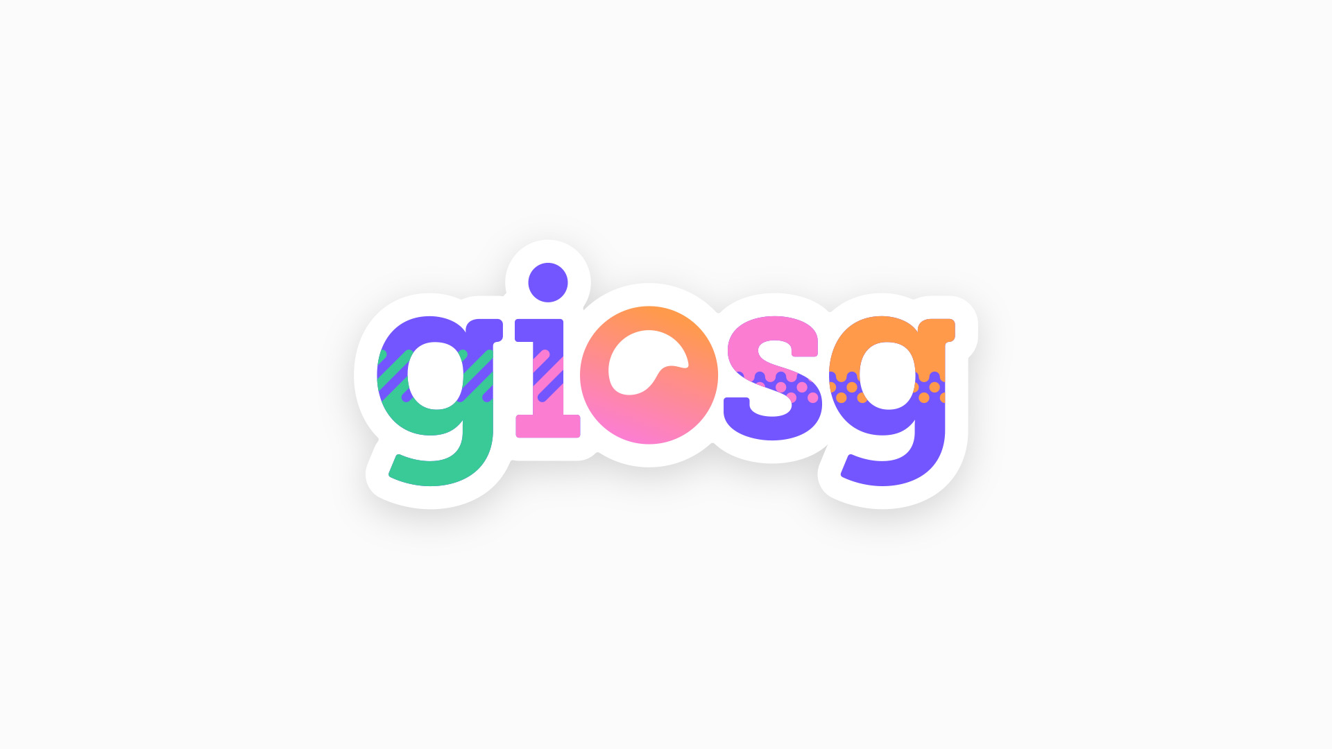
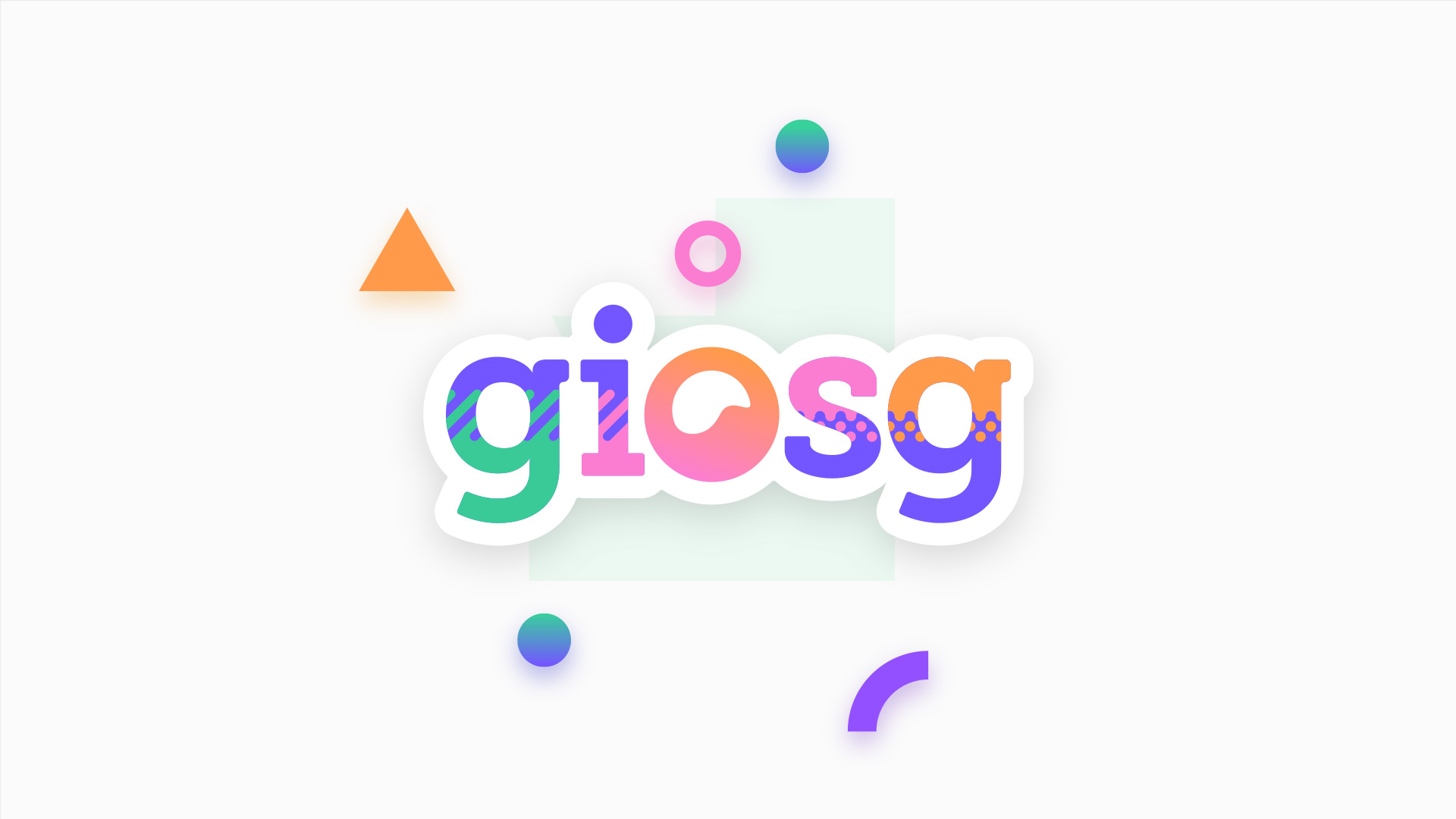
When the basic logo puts on some party gear, it becomes the party mode logo.
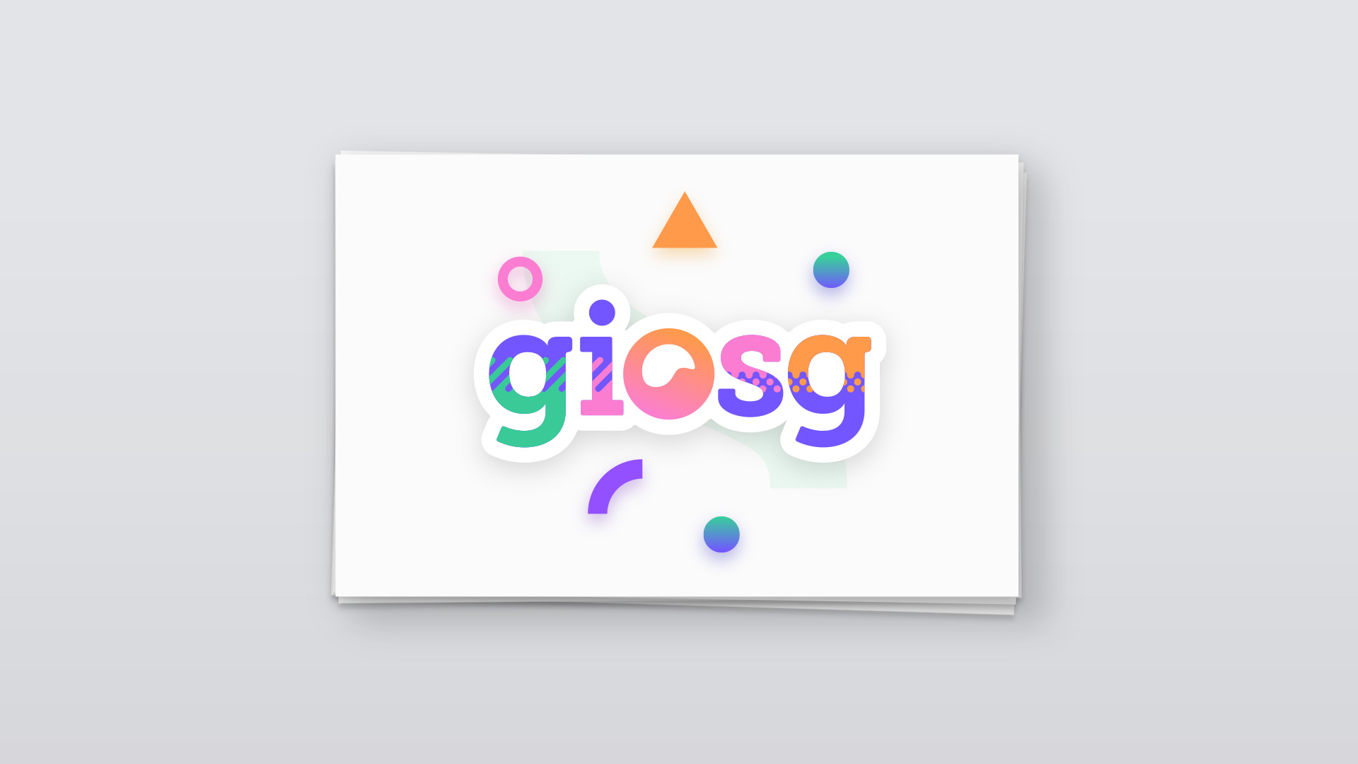
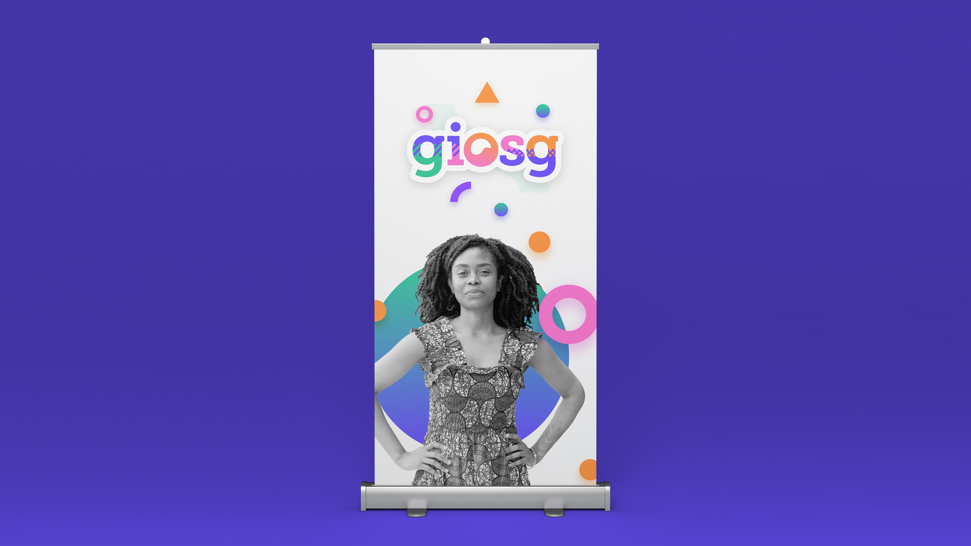
The party mode can be used when the logo is the main focal point of the design, for example on the back of a business card, on a “thank you” page in a presentation or on a roll-up at an event. The party mode logo showcases the giosg color palette and the giosg "attitude", so it should be used whenever it can be used.

The party mode logo can be difficult to read when used in very small sizes or in layouts with many colors, especially on top of photos. In these kinds of cases, it’s best to use the basic logo.
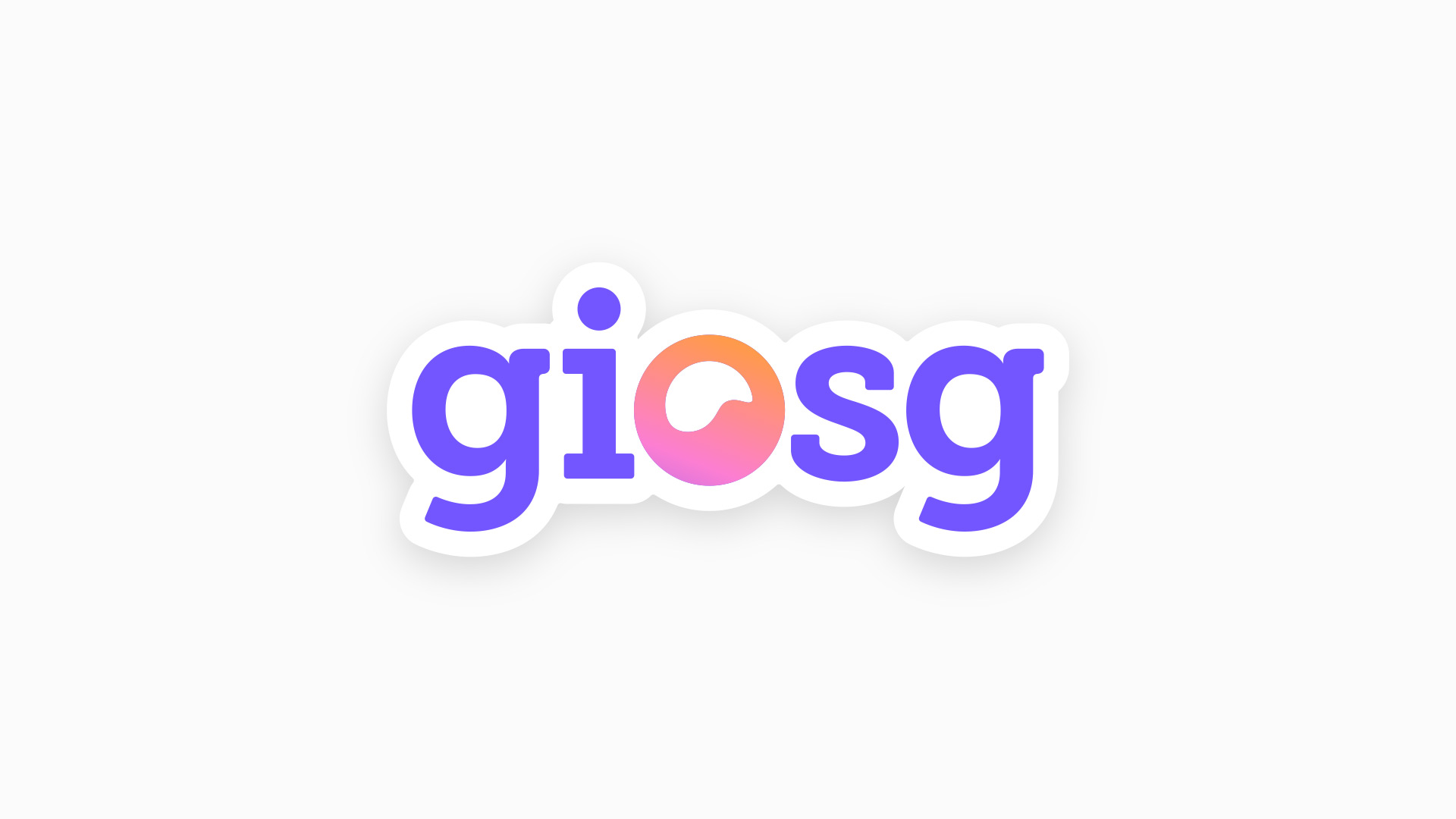
The giosg logo can be used with or without the bubble frame in both the basic variant and the party mode variant. The frame is not needed on white or off-white backgrounds, but it is required on densely colored backgrounds, or when the logo is displayed in color over a photo. The frame should also be used together with a soft drop shadow on an off-white background, especially when the logo is the focal point of the layout and when it appears in a composition with the giosg shapes.

The logo is also offered in an off-white and an off-black variant. These can be used in footers, as watermarks or in other cases where a colored logo would not work as well. Whenever possible, a colored logo should be used instead.
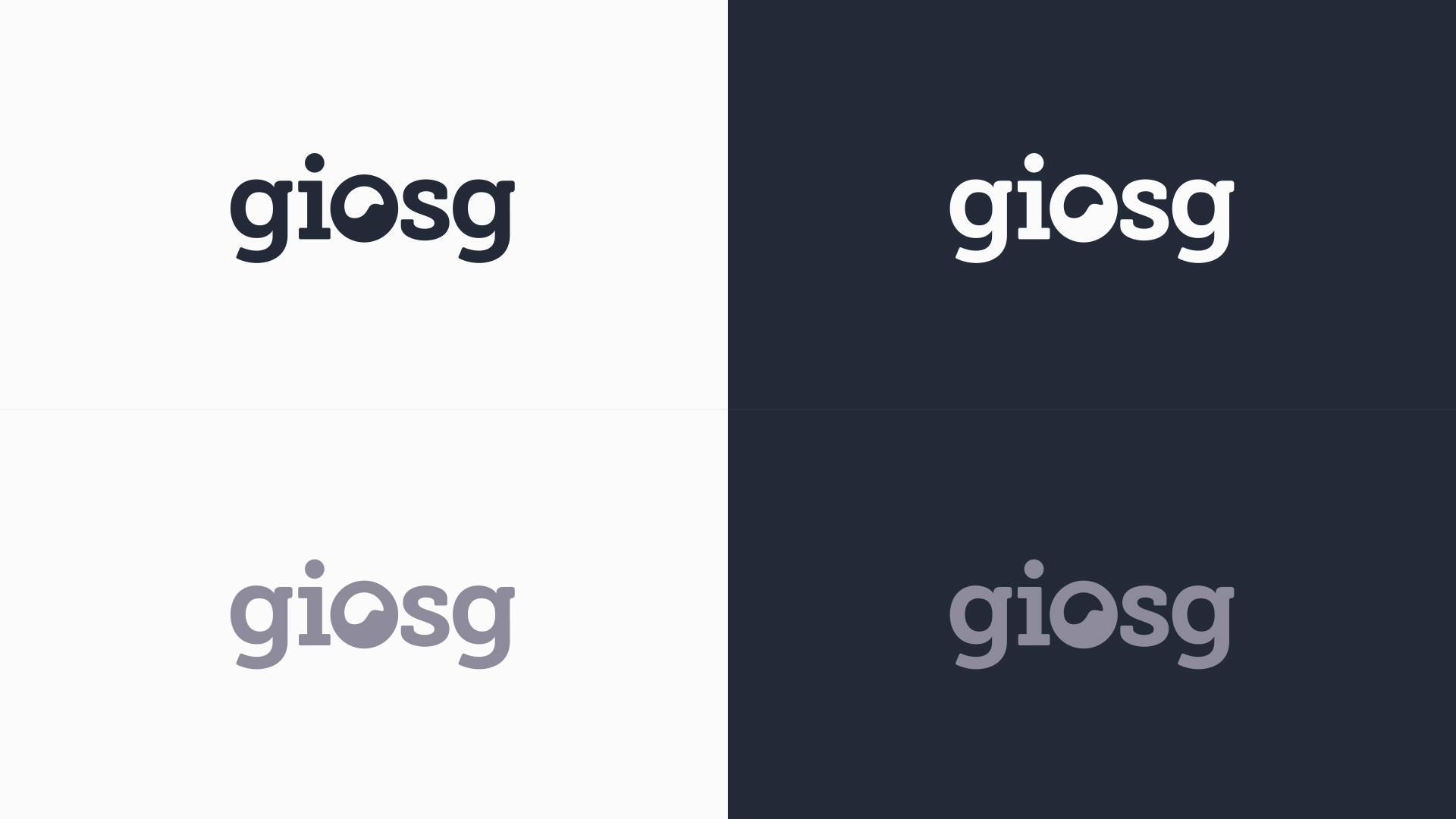
When used in either the black or white variants, the logo can be placed on a colored background or a photo without the frame.
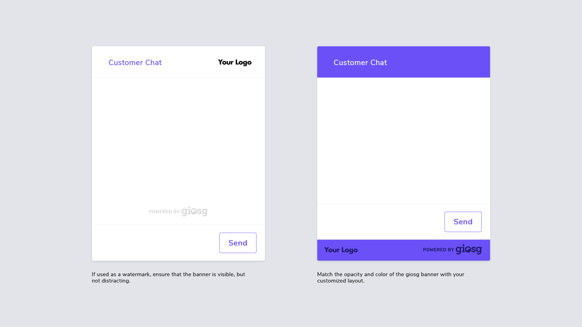
With the announcement of the new giosg visual style, all new giosg chat window customizations are required to use the new “Powered by giosg” banner, unless otherwise agreed. Existing giosg customizations with a giosg logo must also be updated with the new assets as soon as possible.
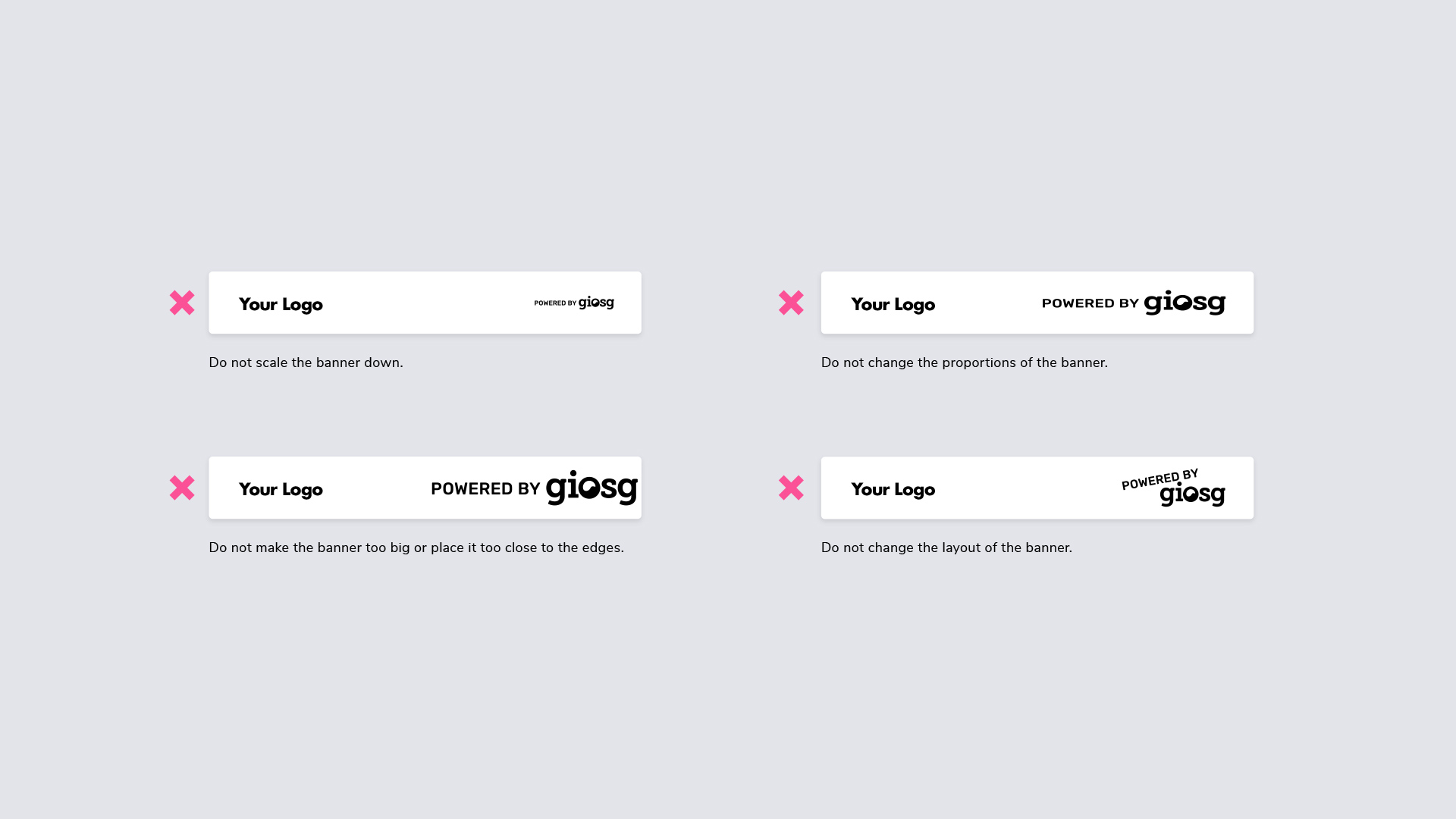
The banner can either appear as a watermark or in a more prominent position next to other logos, or with a background. Users are free to adjust the banner color to match their existing customizations, but the height of the banner must be at least 18 pixels, with the width proportionally resized to match. If the banner version with the background is used, the height of the banner must be at least 32px. It is recommended to use the @2x resolution of the assets to ensure a sharp appearance on modern displays.
All Powered by giosg banners are included in the giosg assets pack. Extract the archive and choose the file that suits the needs of your chat window.
Please note that the example logo placements for your own logo in the following images are not mandatory, you are still free to customize the chat window as you see fit.
All our logo assets are bundled in the giosg assets pack. It includes the logo in all its variants in bitmap and vector formats, as well as the giosg bubble emblem.
For any digital use case, deliver the logo in the .pdf or .png format. For print, deliver the .pdf format from the Print folder.
When a vector file is needed, always supply the .pdf version in either RGB (screen) or CMYK (print), depending on the use case.
When a bitmap image is needed, always supply the .png version. The logo can be converted to a .jpg file if a service requires it, but a flattened version without transparency should only be used if absolutely required.
If you need a logo or any other graphics for any giosg account, let the design team know.
This section details the typefaces and cuts used in giosg designs. The font selections are final, but the sizing and usage are very likely to change and grow as the style is further used.
The primary display typeface for headers is Rubik Bold. It is used for large headlines on the web as well as in presentations. It has a wide, slightly rounded and soft style, and combined with the body typeface, it creates a strong but friendly look.
The primary body typeface for giosg is Nunito Sans. It is used for body text across all platforms and for all text in our UI designs. For the web and in presentations it is combined with Rubik Bold for headlines, but for longer passages of text and in smaller sizes, Nunito Sans is also used for the smaller headers.
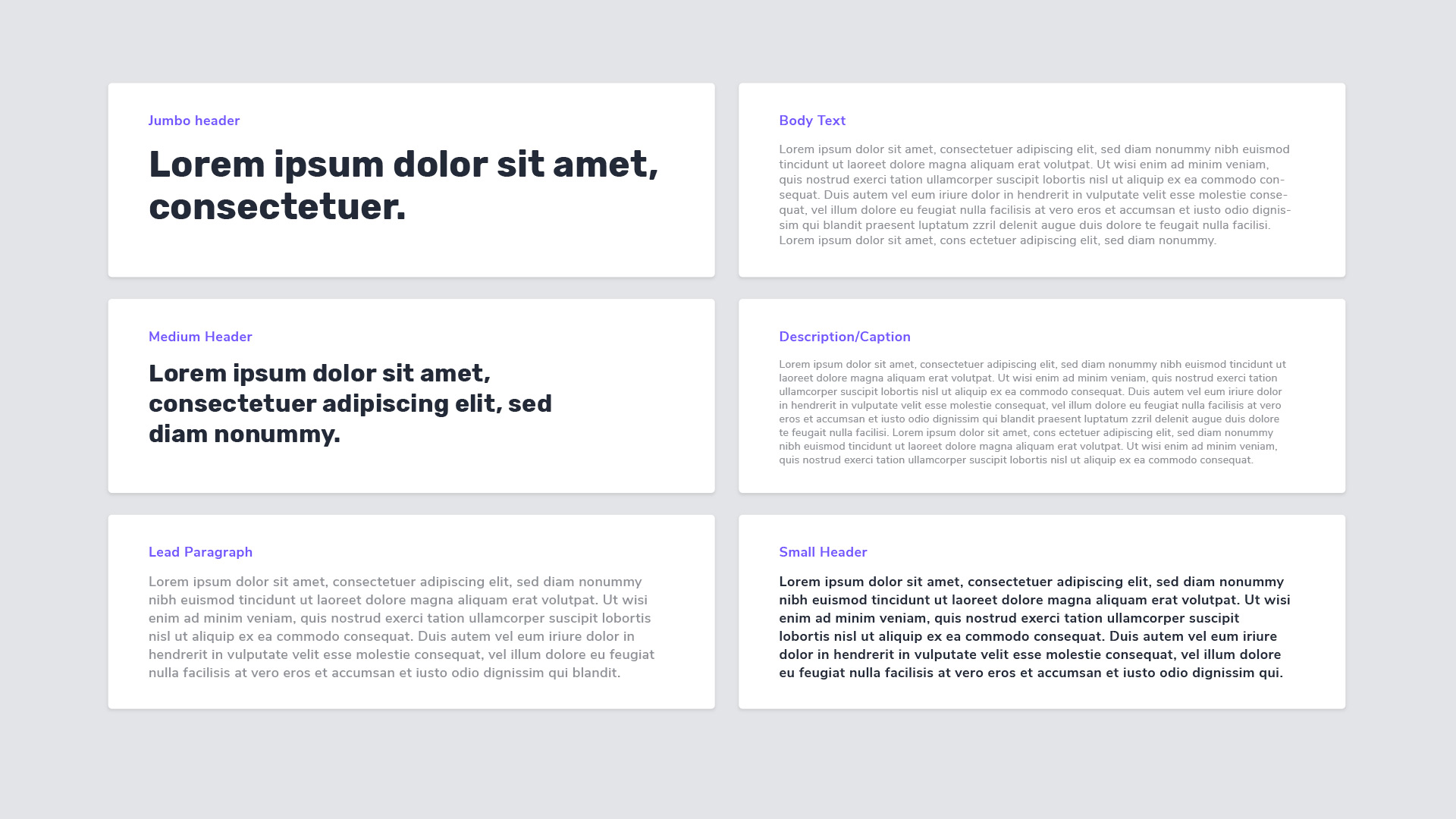
These are some of the header styles.
Jumbo
Font: Rubik Bold
Size:48pt
Line height: 56pt
Tracking: 10
Section
Font: Rubik Bold
Size: 32pt
Line height: 40pt
Tracking: 10
Card header
Font: Nunito Sans Semibold
Size: 18pt
Line height: 24pt
Tracking: 25
UI Text box label
Font: Nunito Sans Semibold
Size: 16pt
Line height: 22pt
Tracking: 25s
The sizes listed here have been selected so that one font size can be used on all devices. The font is readable on mobile devices and on desktops it has a wide, modern look.
Body text
Font: Nunito Sans Light
Size: 16pt
Line height: 20pt
Tracking: 25
Lead paragraph
Font: Nunito Sans Semibold
Size: 18pt
Line height: 24pt
Tracking: 25
Descriptions and captions
Font: Nunito Sans Regular
Size: 14pt
Line height: 18pt
Tracking: 25
All our fonts are included in the giosg assets pack. You can also download the fonts directly on Google Fonts:
When creating new presentations, always use our presentation template on Google Slides (once it's made available to all). It already includes all our fonts and styles. It is best to duplicate the existing template to create a new presentation, that way you get all the assets included in the file.
If you need to create another document on Google, you can also find our fonts in the fonts menu. If they do not show up instantly, click on More fonts and search for Rubik and Nunito Sans. Note that Rubik and Rubik Mono One are not the same, and Nunito is not the same as Nunito Sans!
To install the fonts locally on a Mac, download or copy the zip files on your computer. Extract the archive. Open the Font Book app in the Applications folder. Drag the folder for both fonts into the Font Book window.
To install the fonts locally on Windows, try a bit of googling.
In order to avoid missing or broken fonts, always use Google Slides to create and present your slides. If you need to deliver a presentation to a client, export it as a PDF. This way the fonts will be included in the file.
Please note that PowerPoint files do not carry the font files over to the recipient, and the result will look broken. Avoid using PowerPoint and use Google Slides instead, or export your presentations as PDF files before sending them out.
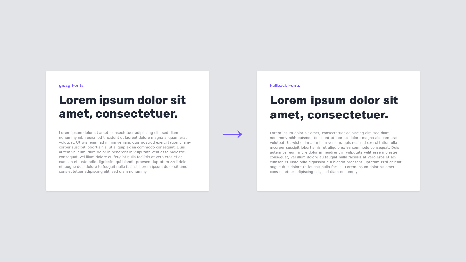
Some very rare cases can appear where we can’t use our brand typefaces and need to use fallback fonts instead, selected from the set of system fonts that are available on nearly all computers. These fonts are chosen because of similar characteristics with the correct fonts, but they are far from perfect. In these cases, our Rubik typeface can be replaced with Arial Black, and Nunito Sans can be replaced with Verdana.
These fonts apply only to the cases where we simply do not have a choice – if the correct fonts can be used, they must be used.
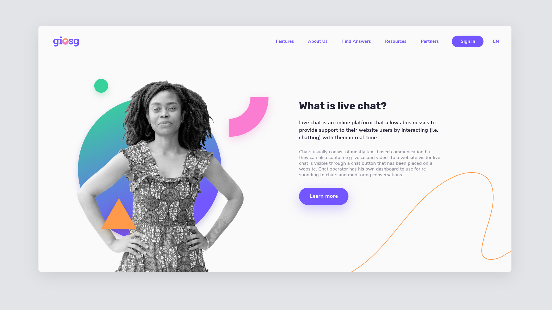
giosg is a truly multicolor brand, with a set of delicious colors appearing against an off-white or white background. The giosg look is fresh, bright and colorful, with contrast where it’s needed. A set of gray tones has been created to support the bright and saturated main colors, and to suit our UI needs.
Color is introduced to the layouts often, but primarily through our shapes, CTAs and other visual elements – not so much as large background areas. Whitespace is an important part of the giosg style.
Although the giosg palette contains darker tones as well, they should be used in moderation. The primary look is always darker tones on a brighter background, not the other way around. This principle can be broken in cases that demand a certain appearance, such as footers or code snippets, but should be avoided elsewhere, especially in cases where a visitor or potential customer is exposed to giosg for the first time — the first impression must always be bright and colorful.
This is the giosg color palette for all digital uses.
These are giosg color tones adjusted for print. Because of differences in the color production process, exact same tones can't be achieved on screens and in print.
Note: the off-white and off-black tones should not be used for backgrounds or text in print, white and K100% should be used instead.